How many ads should you actually be running?
The rules of thumb say one ad per $2,000–3,000 of spend. We went looking for the data behind that number, found a 578,750-ad dataset instead, and learned it isn't a constant at all.

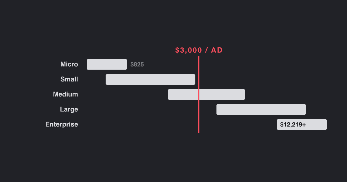
We set out to build a small calculator: put in your monthly ad spend, get back how many ads you should be making. The hard part turned out to be the very first constant.
The rules of thumb are easy enough to find. One ad per $2,000 of spend. One per $3,000. One concept per $9,000, three ads to a concept. They're quoted confidently and they mostly agree with each other, which is reassuring right up until you go looking for what any of them are based on.
As far as we can tell, nothing. The most-cited figure traces back to an analysis of 80 DTC accounts that publishes no methodology, no time period, and no sample composition — and where the per-creative number turns out to be a recommendation derived from the study rather than a finding of it. The rest is blogs citing blogs, occasionally citing practitioner posts, occasionally citing each other in a small circle.
None of that makes the advice bad. Experienced media buyers converging on a similar number is real evidence of a sort. But it's a poor thing to hard-code into a form field, because a calculator makes a number look measured whether or not it is.
So we went looking for something with an actual sample behind it.
The one dataset here with a real sample
Motion's Creative Benchmarks 2026: 578,750 unique creatives, 6,015 advertiser accounts, $1.29 billion in Meta spend, September 2025 through January 2026. Motion publishes its methodology in full, which is rarer than it should be.
The definitions matter for everything below:
- A winner is a creative that spent at least 10× the account's median creative spend, and at least $500. That's a strict bar — roughly the 92.3rd percentile.
- A mid-range creative spent for 28 days or more without clearing that bar.
- A loser was switched off before 28 days.
One detail Motion doesn't flag but which shapes every number: accounts that launched fewer than 10 creatives during the window were excluded. So "Micro" doesn't mean small advertisers. It means small advertisers who still shipped at least 10 creatives in four months. The volume figures skew high because of it, most at the bottom.
Volume by spend tier
Here is what accounts actually ship, from Motion's key benchmarks summary:
| Tier | Monthly spend | Median creatives/week | Avg hit rate |
|---|---|---|---|
| Micro | <$10K | 2.8 | 4.0% |
| Small | $10K–50K | 4.1 | 6.5% |
| Medium | $50K–200K | 6.7 | 8.1% |
| Large | $200K–1M | 11.2 | 8.6% |
| Enterprise | $1M+ | 18.9 | 8.8% |
A warning if you go to the source yourself. Motion also publishes a mean, and it runs 40–55% above the median — 9.3 against 6.7 at the Medium tier. The distribution is heavily right-skewed, so the mean describes a busy outlier rather than a normal account. Use the median.
This is worth being careful about because Motion's own channels disagree on which is which. The key benchmarks page labels 2.8 / 4.1 / 6.7 / 11.2 / 18.9 as the median and gives a separate, higher mean series. The machine-readable edition labels those same values "mean." A summary page inside that edition gives a third set of medians. Pick the wrong one and everything downstream moves by about 40%.
Remember: when a source publishes both a mean and a median for skewed data, the gap between them is the story. Here it's the difference between describing a normal account and describing a busy one.
The number isn't a constant
Take the median volume, multiply out to a month, divide into each tier's spend. That gives you what an ad actually costs in budget terms:
| Tier | Ads/month | At the tier midpoint | Across the whole tier |
|---|---|---|---|
| Micro | 12 | ~$410 | up to $825 |
| Small | 18 | ~$1,690 | $563 – $2,816 |
| Medium | 29 | ~$4,310 | $1,723 – $6,894 |
| Large | 48 | ~$12,370 | $4,124 – $20,620 |
| Enterprise | 82 | ~$18,330 | $12,219 and up |
Spend per ad spans about 45× from the smallest accounts to the largest.
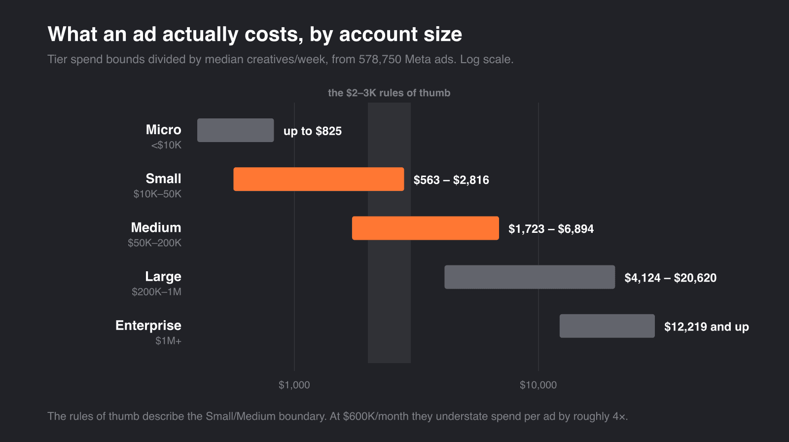
That's the whole problem with a flat figure. It isn't wrong so much as silently scoped: every one-ad-per-$X rule describes one part of the range, presented as if it described all of it.
The part it describes is the Small/Medium boundary. Apply $3,000 per ad to a $30k/month account and you'll plan 10 ads for the month, where the median comparable account ships about 18. Apply the same figure at $600k and you'll plan 200, where the median ships about 48.
So we kept the shape of the calculator and replaced the constant with the table.
Below $10k a month, the volume argument doesn't apply
The winner counts, broken out by tier and top quartile, are blunt:
| Tier | Winners/month, typical account | Winners/month, top 25% |
|---|---|---|
| Micro | 0.00 | 0.00 |
| Small | 0.25 | 0.50 |
| Medium | 0.75 | 2.00 |
| Large | 1.75 | 5.99 |
| Enterprise | 3.99 | 10.48 |
A typical Micro account produces zero winners in a month. So does the top quartile of Micro accounts. At that spend there isn't enough budget for any single ad to reach both 10× the account median and $500, so the metric has nothing to find.
That's not a statement about whether small advertisers can make good ads. It's a statement about what this particular measurement can see. But it does mean advice shaped like "ship N ads to find a winner" is empty below roughly $10k/month. The useful question down there isn't arithmetic at all — it's how much you can produce without the quality dropping.
The top-25% column is the more interesting one. Those accounts aren't spending more than their peers; they're in the same tier by definition. They're shipping between 1.7× and 2.9× the creative volume on the same budget, and the gap widens as accounts get bigger.
Most ads don't spend, and that's the normal case
Across every tier, about half of all creatives are switched off before 28 days (full report):
| Tier | Losers | Mid-range | Winners |
|---|---|---|---|
| Micro | 50.2% | 46.0% | 3.7% |
| Small | 49.3% | 44.6% | 6.2% |
| Medium | 52.6% | 40.1% | 7.3% |
| Large | 53.9% | 38.0% | 8.1% |
| Enterprise | 52.2% | 39.6% | 8.2% |
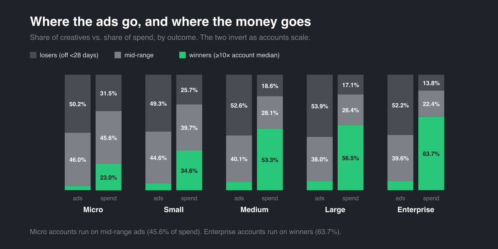
The middle column is the one that gets ignored. Roughly 40% of creatives never become winners but keep running and keep taking spend — and in smaller accounts they carry more of the budget than the winners do. Micro accounts put 45.6% of spend through mid-range ads and only 23.0% through winners. By Enterprise that inverts to 22.4% and 63.7%.
The portfolio changes shape as you scale. Small accounts run on steady performers with the occasional break-out. Large accounts run on break-outs, with steady performers absorbing the churn underneath. Treating a mid-range ad as a failed test misreads what it's doing.
Remember: roughly half of everything you ship will be off within four weeks. That's the median experience across 6,015 accounts, not a sign that something is broken.
Your industry moves the answer more than you'd expect
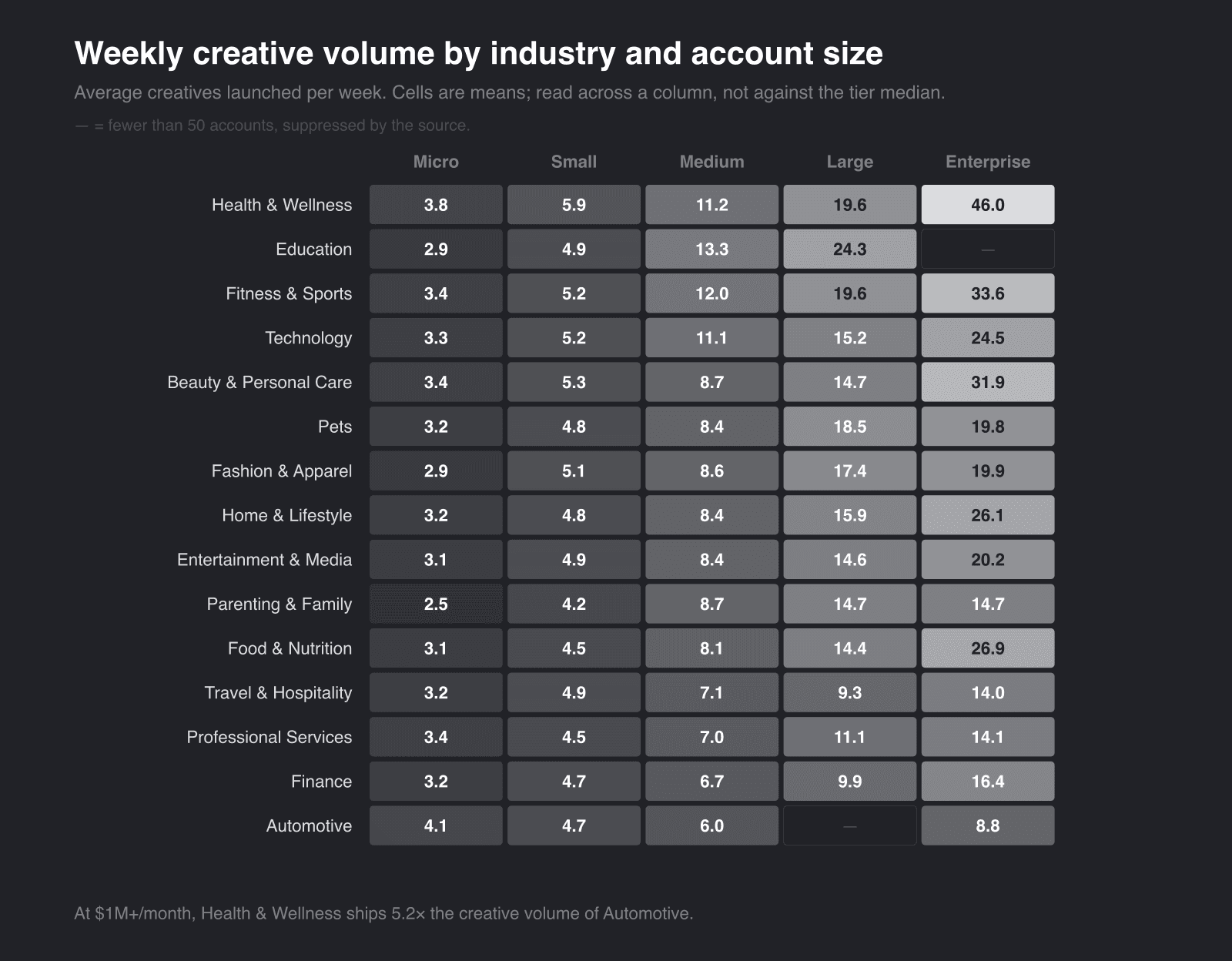
Average creatives per week, by vertical and tier. This one sits behind an email gate on the full report:
| Vertical | Micro | Small | Medium | Large | Enterprise |
|---|---|---|---|---|---|
| Health & Wellness | 3.8 | 5.9 | 11.2 | 19.6 | 46.0 |
| Education | 2.9 | 4.9 | 13.3 | 24.3 | — |
| Fitness & Sports | 3.4 | 5.2 | 12.0 | 19.6 | 33.6 |
| Technology | 3.3 | 5.2 | 11.1 | 15.2 | 24.5 |
| Beauty & Personal Care | 3.4 | 5.3 | 8.7 | 14.7 | 31.9 |
| Pets | 3.2 | 4.8 | 8.4 | 18.5 | 19.8 |
| Fashion & Apparel | 2.9 | 5.1 | 8.6 | 17.4 | 19.9 |
| Home & Lifestyle | 3.2 | 4.8 | 8.4 | 15.9 | 26.1 |
| Entertainment & Media | 3.1 | 4.9 | 8.4 | 14.6 | 20.2 |
| Parenting & Family | 2.5 | 4.2 | 8.7 | 14.7 | 14.7 |
| Food & Nutrition | 3.1 | 4.5 | 8.1 | 14.4 | 26.9 |
| Travel & Hospitality | 3.2 | 4.9 | 7.1 | 9.3 | 14.0 |
| Professional Services | 3.4 | 4.5 | 7.0 | 11.1 | 14.1 |
| Finance | 3.2 | 4.7 | 6.7 | 9.9 | 16.4 |
| Automotive | 4.1 | 4.7 | 6.0 | — | 8.8 |
At the Medium tier, Education ships 13.3 a week against Automotive's 6.0. At Enterprise, Health & Wellness ships 46.0 against Automotive's 8.8 — more than five times the output on comparable budgets.
One catch: these cells are means, while the tier table above is medians. Don't read a cell as your target. Read it as a ratio against the other verticals in the same column, then apply that to the tier median.
What this data can't tell you
Motion is direct about the biggest limitation, and it's worth repeating because it's easy to lose: the report doesn't tie any of this to ROAS, revenue, or conversions. Spend is where Meta's auction put budget. A winner is an ad the algorithm fed, which is not the same as an ad that made money.
That rules out a whole class of question people reasonably want answered — anything of the form "how many ads do I need to hit a revenue target." You can get there with your own ROAS and your own average order value, but the arithmetic is yours, not this dataset's, and it should be labelled that way wherever it's shown.
Two more worth carrying:
The window is September to January. That's BFCM and gifting season, one of the most competitive stretches of the year. Motion notes this when discussing which hooks and formats performed, but the caveat applies just as much to the volume figures, which are the ones most people will quote. Treat them as peak-season, not annual.
Motion sells creative analytics. The sample isn't described as a random draw of Meta advertisers, and "ship more creative, find more winners" is a conclusion that happens to suit the vendor. That doesn't make it wrong. It does mean it isn't independent, and it's worth saying out loud before building a tool on someone else's numbers.
Check the numbers before you ship them
Motion distributes the report through several channels, including a machine-readable bundle labelled "Share with ChatGPT/Claude." We nearly built our defaults from it. It's OCR'd from the PDF, and it's wrong in two ways we could demonstrate.
The vertical table admits in its own notes that it is "not fully reconstructed from OCR," and ships an illustrative version with rows mis-assigned — the Fashion & Apparel row carries Fitness & Sports' numbers.
The visual-format table is 10× low on every count. It gives 1,100 winners for offer-first banners where the rendered report gives 11,006.
The second one is catchable with arithmetic. Sum the winner column across all 25 visual formats and you get 48,913 — about 8.5% of the 578,750 creatives in the dataset, which lands on Motion's own statement that the 10× bar sits at the 92.3rd percentile. The bundle's figures sum to 0.85%, an order of magnitude below any winner rate the report states anywhere.
Remember: if a dataset gives you both totals and rates, they're a checksum. Multiply one by the other before trusting a table you didn't extract yourself.
The rendered report pages are reliable — values come out of the page as text. It's the convenience formats that drift.
What we built
The calculator is here. Spend and industry go in; a weekly creative target, an expected winner count and a per-ad cost come out, from the tables above rather than a single flat rate. It also ranks the industries at your tier and sets your plan beside the top quartile of accounts on the same budget — the comparison the published grid makes hardest to see.
The volume and the winner rate are both editable, because your account is not the median of 6,015 others. There is no revenue input, and that is deliberate: as above, this dataset cannot support one. The tier table sits underneath with your own row marked, so the answer is never more than a step from the evidence for it.
If there's one thing worth taking beyond the tables: the flat per-ad figures aren't wrong, they're unscoped. A rule of thumb that tells you which accounts it applies to is more useful than a tidier one that doesn't.
Sources
Every figure above comes from Motion's Creative Benchmarks 2026. It's spread across several pages, which is part of why the numbers drift between them — so here is each one and what it's good for.
- Creative Benchmarks 2026 — the research landing page and the canonical citation.
- Full report — the narrative, the portfolio and spend-split charts, and the complete visual-format, hook and asset-type tables. The vertical breakdown here is email-gated.
- Key benchmarks summary — the tier table with median, mean and hit rate side by side. The most useful single page, and the one to trust when the others disagree.
- Methodology and definitions — winner, mid-range and loser definitions, tier boundaries, suppression rules, and Motion's own stated limitations.
- "How many creatives do you actually need to launch?" — the all-accounts vs top-quartile volume and winner tables.
- Machine-readable bundle — useful for structure, unreliable for numbers. See above.
For contrast, the source most of the circulating rules of thumb trace back to: MHI Media's "how many creatives to test". Read the methodology section, or rather notice that there isn't one.