Black-and-White Problem Footage
Clips depicting the viewer's hassle or the 'before' state are drained to black and white before snapping to full colour for the solution.
How to spot it
Greyscale or heavily desaturated pain-point shots contrast sharply with bright full-colour footage once the product appears.
Verified on real video ads across 41 of 240 tracked brands (138 sightings across 79,497 ads).
Creative strategy
Why use Black-and-White Problem Footage
Removing color from the opening frustration shot gives viewers an instant visual cue that they are looking at the problem state. Even with sound muted, a monochrome clip creates emotional tension around discomfort, mess, or embarrassment. When the edit snaps into bright, saturated color as the product enters, the relief feels unmistakable and anchors the product directly to the solution.
When to use it
- Open problem-agitation hooks for skincare, nail care, pet care, or supplements by showing visible irritation or dullness in monochrome.
- Highlight messy spills, tangled cords, or clunky old tools in grayscale before revealing a sleek home gadget in bright color.
- Frame awkward or embarrassing daily moments in black and white to signal clearly that the ad is parodying the old hassle.
When to skip it
- Skip monochrome pain shots for luxury fashion, gourmet food, or aspirational beauty ads that rely purely on elevated desire.
- Avoid infomercial-style black-and-white tropes if your brand voice targets skeptical buyers who dismiss exaggerated problem skits.
Production guide
How to produce Black-and-White Problem Footage
- 1
Drop saturation completely on the opening two to four seconds while showing the frustration, symptom, or clumsy workaround.
- 2
Boost contrast slightly in the monochrome grade so facial expressions and problem textures remain crisp on bright phone screens.
- 3
Snap back to warm, vibrant color on the exact cut or audio hit where the product arrives to fix the issue.
- 4
Pair the grayscale segment with a brief red X icon, record scratch, or tense beat to reinforce the tonal shift.
Common mistakes
- Staying in black and white past four seconds makes the ad feel gloomy and drags down early feed retention.
- Fading color back in slowly weakens the emotional contrast that makes the product reveal feel like instant relief.
- Applying dull grayscale over dark, poorly lit footage turns the problem subject muddy and unreadable on mobile.
Field notes
Observed in real ads
- 1
The video desaturates to monochrome while illustrating the pain point of chipped, dull generic press-ons.
- 2
Opening clips of the dog scratching and squatting are graded in black-and-white to visually signal an unpleasant 'before' state.
- 3
Footage of a woman self-consciously hiding her poorly painted hand is desaturated to black and white to emphasize embarrassment.
Also called
Cross-layer recipes
Pairs well with
Combine Black-and-White Problem Footage with patterns from other layers to assemble a complete ad.
 +2 sub
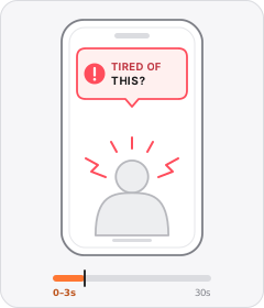
Problem Callout
The ad opens by naming or asking about a problem the viewer has.

UGC-Studio Hybrid
The ad switches deliberately between raw phone-shot creator clips and glossy studio commercial footage.

Checklist Overlay
A stacked vertical list of short points marked with checkmarks, bullets or emoji icons appears over the footage.
 +2 sub
Problem-Solution
The ad establishes an everyday frustration in the first act and introduces the product as the fix.
Start free
Build a Black-and-White Problem Footage ad in minutes
Start with 7 days free in a ready-made demo workspace. No credit card required.