App Store Badges
Official Apple App Store and Google Play download badges appear on screen or on the closing card.
How to spot it
The familiar black 'Download on the App Store' and 'Get it on Google Play' pills side by side.
Verified on real video ads across 13 of 240 tracked brands (727 sightings across 79,497 ads).
Creative strategy
Why use App Store Badges
Mobile users hesitate to tap an app ad when they are unsure whether the product supports their device. Showing the familiar iOS and Android store download buttons settles compatibility in one glance and signals formal marketplace review. Pairing those recognizable buttons with a closing logo lockup guides ready viewers straight toward installation.
When to use it
- Consumer mobile apps in fitness, finance, learning, and gaming benefit from clear store badges on closing cards.
- Cross-platform SaaS products promoting a mobile companion app use dual store pills to verify iOS and Android access.
- Connected home gadgets that pair with a control app can flash store badges to prove smooth mobile setup.
When to skip it
- Skip dual store badges when you run OS-targeted campaigns that only serve to iOS or Android devices.
- Avoid showing app badges in web-first SaaS funnels where you want users signing up on a browser landing page.
Production guide
How to produce App Store Badges
- 1
Download official App Store and Google Play vector badges from each platform's brand guidelines to keep proportions exact.
- 2
Align both badges at equal height side by side beneath your app icon and short download headline on the end card.
- 3
Hold the closing lockup for two to three seconds with generous padding around both pills for crisp mobile readability.
- 4
Export single-badge end cards for OS-targeted ad sets so iOS viewers see App Store and Android viewers see Google Play.
Common mistakes
- Stretching, recoloring, or redrawing official store buttons violates brand guidelines and makes the app look untrustworthy.
- Shrinking the badges into a cramped corner makes the store logos unreadable on TikTok and YouTube Shorts.
- Showing both badges in an ad set targeting a single operating system wastes space and lowers relevance on Meta.
Field notes
Observed in real ads
- 1
Official Google Play and Apple App Store badges are displayed side-by-side to direct mobile app installs.
- 2
A full-screen branded lime-green card closes the video with the logo, a call to download the app, and Apple App Store and Google Play badges.
- 3
Official Google Play and Apple App Store download buttons appear side by side beneath the logo.
Also called
Cross-layer recipes
Pairs well with
Combine App Store Badges with patterns from other layers to assemble a complete ad.
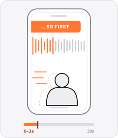
In Medias Res Hook
The ad starts abruptly in the middle of a physical task or mid-sentence, skipping any greeting.
 +1 sub
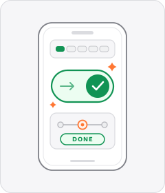
Effortless Convenience
The ad argues that setting up or using the product takes almost no skill or effort and fits seamlessly into daily life.
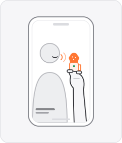
Handheld Mini Mic
The speaker holds a tiny wireless or lapel microphone between their fingers while talking to camera instead of clipping it on.
 +1 sub
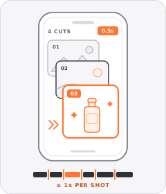
Quick-Cut Montage
The ad strings together a rapid sequence of distinct shots lasting roughly a second or less each.
Start free
Build a App Store Badges ad in minutes
Start with 7 days free in a ready-made demo workspace. No credit card required.