Product Lineup
Cutouts of multiple flavours, shades or models are arranged side by side on screen to showcase the range.
How to spot it
A row, fan or scrolling carousel of several product variants displayed together in one frame.
Verified on real video ads across 85 of 240 tracked brands (322 sightings across 79,497 ads).
Creative strategy
Why use Product Lineup
Arranging multiple flavors, shades, or models side by side signals catalog depth and reassures shoppers that one option matches their exact preference. A tidy row or fan of packaging acts as a quick visual menu, encouraging variety-pack and bundle clicks. Showing clean cutouts together lets viewers compare colors, sizes, or tiers at a glance right inside the feed.
When to use it
- Feature product lineups for food and beverage, supplements, pet care, and cosmetics sold across multiple flavors or shades.
- Display colorways, size editions, or tiered hardware models together in apparel, footwear, and consumer electronics closing cards.
- Show full multi-step skincare or hair care regimens side by side to lift bundle interest and average order value.
When to skip it
- Skip lineup layouts for single-SKU hero products where duplicating one bottle three times adds no real selection story.
- Avoid flashing six complex product tiers in cold awareness hooks before viewers understand what the core category solves.
Production guide
How to produce Product Lineup
- 1
Cap static lineup frames at three to five hero variants so each bottle, bag, or device stays sharp on mobile.
- 2
Use a smooth horizontal scrolling carousel when presenting six or more flavors, shades, or styles without shrinking cutouts.
- 3
Match camera perspective, lighting direction, and relative scale across all packshots, then add gentle ground shadows beneath the row.
- 4
Place short two-word flavor, shade, or model labels below each cutout so shoppers scan available options in one beat.
Common mistakes
- Squeezing eight tiny cutouts onto a vertical phone frame renders package labels unreadable on Meta and TikTok.
- Combining mismatched photography angles or harsh lighting differences makes the graphic lineup look patched together.
- Omitting short variant labels under similar-looking bottles leaves YouTube Shorts viewers guessing how the options differ.
Field notes
Observed in real ads
- 1
Three varieties of pet food bags—two dog, one cat—stand side by side in the center of the endcard while a handball and kibble bounce past.
- 2
The closing graphic displays multiple product bottles alongside their individual names.
- 3
Branded product packaging is displayed against a warm red background alongside descriptive product text.
Also called
Cross-layer recipes
Pairs well with
Combine Product Lineup with patterns from other layers to assemble a complete ad.
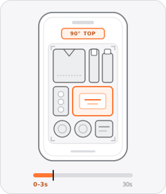
Flat-Lay Hook
The ad opens with a neat overhead shot of products or clothes arranged on a flat surface.
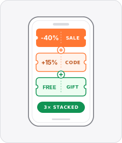
Offer Stack
The ad piles multiple discounts, promo codes and free perks on top of one another in a single deal.
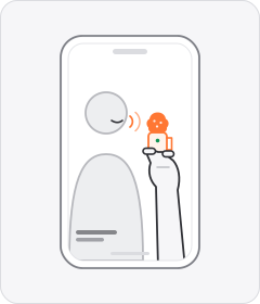
Handheld Mini Mic
The speaker holds a tiny wireless or lapel microphone between their fingers while talking to camera instead of clipping it on.
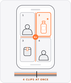
Multi-Panel Grid
The frame divides into three or more tiles—such as a triptych or two-by-two grid—playing multiple clips simultaneously.
Start free
Build a Product Lineup ad in minutes
Start with 7 days free in a ready-made demo workspace. No credit card required.