App UI Overlay
Screenshots, screen recordings or cropped widgets from the brand's app float over the live-action footage.
How to spot it
Phone app screens, dashboards or UI cards popped over the speaker to show what the software looks like.
Verified on real video ads across 79 of 240 tracked brands (842 sightings across 79,497 ads).
Creative strategy
Why use App UI Overlay
Floating real interface cards over live-action footage proves the software works and shows how simple the workflow feels before anyone installs. Combining a human presenter with clean charts, trackers, or booking widgets bridges abstract digital benefits and daily use. Mobile-native UI previews draw immediate recognition from scrollers and filter for higher-intent clicks.
When to use it
- Overlay clean UI cards in mobile app and SaaS ads showing onboarding steps, habit trackers, budgets, or AI outputs.
- Pair live footage of smart home gadgets or fitness wearables with companion app screens showing metrics and quick controls.
- Show booking, meal-planning, or customization widgets in subscription service ads to remove sign-up friction before the click.
When to skip it
- Skip interface overlays for physical consumer goods lacking a meaningful software layer where order screens add no persuasive proof.
- Avoid dropping dense desktop dashboards filled with tiny spreadsheet rows that blur into smudges on vertical phone feeds.
Production guide
How to produce App UI Overlay
- 1
Record sharp high-resolution mobile clips or export clean vector UI cards straight from design files for clear phone legibility.
- 2
Crop tightly around the single chart, toggle, or alert matching the spoken line so viewers focus on one action.
- 3
Give floating widgets rounded corners and soft shadows, animating them on screen right when the speaker names that feature.
- 4
Scale key metrics, buttons, and progress bars larger than normal phone proportions so muted viewers read figures effortlessly.
Common mistakes
- Shrinking an entire crowded phone screen into a small corner makes labels unreadable on TikTok and YouTube Shorts.
- Using frozen static screenshots for interactive flows misses the persuasive punch of a brief three-second screen recording.
- Centering a wide UI overlay over the presenter's eyes or mouth breaks visual connection on Meta Reels.
Field notes
Observed in real ads
- 1
On-screen demonstrations of the mobile app interface illustrate how to browse offers and battery options.
- 2
Screenshots and screen recordings of the companion app's data tables, charts, and body diagrams are overlaid directly onto the footage as the speaker mentions them.
- 3
A semi-transparent screenshot of the companion app's daily metrics is overlaid across the full frame.
Also called
Cross-layer recipes
Pairs well with
Combine App UI Overlay with patterns from other layers to assemble a complete ad.
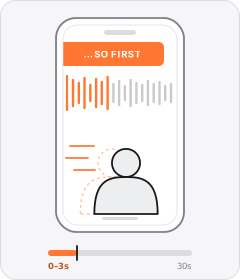
In Medias Res Hook
The ad starts abruptly in the middle of a physical task or mid-sentence, skipping any greeting.
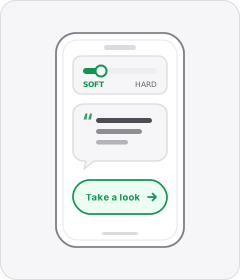
Soft Call to Action
The ad wraps up with a casual, low-pressure suggestion to check the product out rather than a hard sales push.
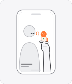
Handheld Mini Mic
The speaker holds a tiny wireless or lapel microphone between their fingers while talking to camera instead of clipping it on.
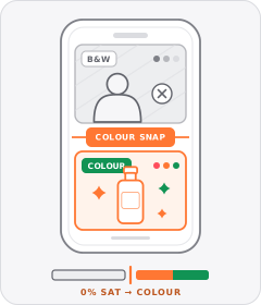
Black-and-White Problem Footage
Clips depicting the viewer's hassle or the 'before' state are drained to black and white before snapping to full colour for the solution.
Start free
Build a App UI Overlay ad in minutes
Start with 7 days free in a ready-made demo workspace. No credit card required.