Faux CTA Button
A graphic styled like a clickable UI button is baked directly into the video frame.
How to spot it
A rounded pill or rectangular button graphic reading 'Shop Now' or 'Learn More' floating inside the video itself, sometimes clicked by an animated cursor.
Verified on real video ads across 135 of 240 tracked brands (1,057 sightings across 79,497 ads).
Creative strategy
Why use Faux CTA Button
Shoppers recognize rounded button shapes from apps and websites, so their eyes jump straight to the prompt. Baking a bright button into the frame reinforces the platform link bar and clarifies the next step during muted autoplay. A brief bounce or animated cursor tap adds visual momentum right before the viewer clicks.
When to use it
- Use this on retargeting ads for skincare, supplements, or apparel when shoppers already recognize the brand.
- Pair faux buttons with quiz funnels, free trials, or discount offers where custom wording outperforms generic platform labels.
- Add a high-contrast button graphic to silent product demos and closing cards that need a clear tap target.
When to skip it
- Skip this on raw handheld creator stories where a polished button graphic breaks the casual mood early.
- Avoid fake buttons in cold awareness ads for complex SaaS or high-ticket home gadgets before proving value.
Production guide
How to produce Faux CTA Button
- 1
Style the graphic as a high-contrast pill with two to four action words like Claim Offer or Take Quiz.
- 2
Place the button well above the bottom safe zone so TikTok captions and Meta link bars never cover the text.
- 3
Animate a slight scale pulse or cursor tap right when the speaker names the offer to pull the eye downward.
- 4
Hold the button steadily on the closing card for at least two full seconds so viewers can read and tap.
Common mistakes
- Placing the button near the bottom edge lets Meta, TikTok, or YouTube Shorts menus cover the label.
- Flashing a fake button in the first two seconds asks for a click before viewers care about the product.
- Repeating vague platform wording like Learn More wastes space that could highlight a specific discount or trial.
Field notes
Observed in real ads
- 1
The ad concludes with an on-screen button urging viewers to murder their thirst.
- 2
A bright green pill-shaped graphic reading "What are you waiting for?" sits at the bottom center of the end card like a clickable button.
- 3
An orange pill-shaped button reading 'Test now' appears at the bottom center while the puppy eats.
Also called
Cross-layer recipes
Pairs well with
Combine Faux CTA Button with patterns from other layers to assemble a complete ad.
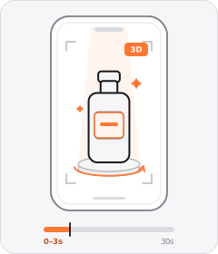
Product Hero Opener
The ad opens in the very first frame on a tight, polished studio or 3D shot of the product.
 +11 sub
Social Proof
The ad shows that other people already buy, trust and like the product.
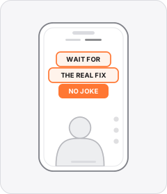
Native Text Box
On-screen copy uses the rounded-corner background pills of TikTok's or Instagram Reels' built-in text editor.
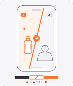
Wipe Transition
A sliding line, expanding graphic shape or passing foreground object sweeps across the frame to replace one shot with the next.
Start free
Build a Faux CTA Button ad in minutes
Start with 7 days free in a ready-made demo workspace. No credit card required.