Kinetic Typography
Large display words and short phrases slam, slide or scale dynamically onto the screen to drive key claims.
How to spot it
Oversized bold words animating onto the frame on beats or vocal accents rather than transcribing full speech.
Verified on real video ads across 135 of 240 tracked brands (1,025 sightings across 79,497 ads).
Creative strategy
Why use Kinetic Typography
Oversized moving words capture attention in the opening second because human eyes track sudden scale and directional motion automatically. Syncing short claims to drum hits or vocal accents breaks visual monotony and keeps muted viewers reading across fast cuts. Tight typographic pacing turns simple product facts and sale numbers into an energetic, scannable pitch.
When to use it
- Deploy kinetic type for seasonal sales, launch promos, and bundle discounts in apparel, electronics, or food and beverage.
- Build montage ads around bold animated headlines when working with studio B-roll or product clips that lack a presenter.
- Highlight short benefit claims like instant setup, pricing, or warranty terms in fast-paced mobile app and SaaS ads.
When to skip it
- Skip aggressive animated headlines in intimate founder testimonials or sensitive wellness stories where moving type distracts from emotion.
- Avoid kinetic display text for dense educational scripts whose long sentences become unreadable during quick vertical cuts.
Production guide
How to produce Kinetic Typography
- 1
Trim your copy into punchy two to four word phrases so mobile viewers absorb each claim in a single glance.
- 2
Pick one bold sans-serif typeface and add a subtle shadow or backing box so letters stay clear over busy footage.
- 3
Snap text entrance keyframes directly to music beats, sound effects, or vocal accents using fast ease-out motion curves.
- 4
Hold crucial numbers like prices, discounts, and warranty terms on screen long enough to read aloud twice comfortably.
Common mistakes
- Animating full paragraphs at high speed causes eye fatigue and drives quick swipes on Meta and YouTube Shorts.
- Mixing three unrelated display fonts and random slide angles makes the creative look cluttered and unfocused.
- Extending oversized words toward the right edge lets TikTok engagement icons clip the final letters.
Field notes
Observed in real ads
- 1
Large sans-serif words slide and snap onto the screen dynamically to introduce the event, product name, and discount.
- 2
Large, 3D-extruded block letters with drop shadows pop onto the screen to label each category and call to action.
- 3
Bold on-screen text overlays communicate the sale event, product name, warranty, and price directly to the viewer.
Also called
Cross-layer recipes
Pairs well with
Combine Kinetic Typography with patterns from other layers to assemble a complete ad.
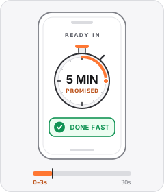
Timeframe Promise
The ad opens by promising a desirable task or result within a specific short amount of time.
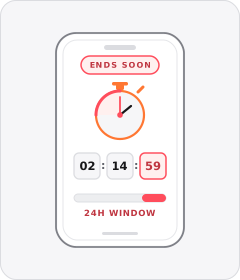
Limited-Time Offer
The ad warns that the discount or promotion is only available for a short window.
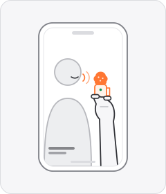
Handheld Mini Mic
The speaker holds a tiny wireless or lapel microphone between their fingers while talking to camera instead of clipping it on.
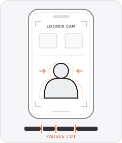
Jump Cuts
Every pause or breath is cut out of a continuous shot so the speaker never stops talking.
Start free
Build a Kinetic Typography ad in minutes
Start with 7 days free in a ready-made demo workspace. No credit card required.