Split Screen
The video frame is divided into two or more panels playing simultaneously.
How to spot it
A vertical, horizontal, or grid divider holding multiple video feeds or graphic panels on screen at once.
Verified on real video ads across 67 of 240 tracked brands (278 sightings across 79,497 ads).
Creative strategy
Why use Split Screen
Structuring an ad into simultaneous panels lets viewers absorb two visual streams at the same time without waiting for a cut. You can hold human attention with a presenter or lifestyle scene in one panel while the paired panel displays product details, specs, or a direct comparison. That multi-panel layout increases visual density and keeps fast scrollers engaged from the opening frame.
When to use it
- Meal kit, supplement, and home gadget brands run side-by-side comparison layouts pitting their product against messy generic options.
- Skincare and fitness brands pair a talking creator in one panel with close-up application or workout footage in the other.
- Apparel and home goods brands pair a scrolling catalog panel with live-action lifestyle footage to show products in use.
When to skip it
- Cinematic brand storytelling and aspirational lookbooks lose visual breathing room when squeezed into tight half-frame boxes.
- Detailed software demos packed with small interface labels become unreadable when shrunk down to half of a phone screen.
Production guide
How to produce Split Screen
- 1
Pick a top-and-bottom horizontal split for vertical placements so both video panels retain generous horizontal framing.
- 2
Establish clear visual hierarchy by placing active motion in one panel while keeping the companion panel steadier or graphic-led.
- 3
Add crisp divider lines and short panel labels so silent scrollers immediately understand what each half shows.
- 4
Reframe subjects deliberately inside each half so faces, hands, and packaging never get clipped by panel borders.
Common mistakes
- Playing two hyperactive video clips simultaneously forces viewers to bounce between panels and miss your primary message.
- Placing vital captions or product callouts across the center seam or beneath TikTok right-side buttons hurts legibility.
- Splitting a vertical canvas left-to-right for wide footage creates narrow strips that distort product proportions on phones.
Field notes
Observed in real ads
- 1
The screen is divided into product cutouts on the left and live-action workout footage on the right.
- 2
The video is divided vertically into two halves: an animated graphic product carousel on the left and a static lifestyle photo on the right.
- 3
The screen is divided vertically to compare the featured meal kit on the left against generic competitors on the right.
Also called
Cross-layer recipes
Pairs well with
Combine Split Screen with patterns from other layers to assemble a complete ad.

Everyday Couple
A romantic couple shares the frame to discuss, test, or use the product as part of their life together.
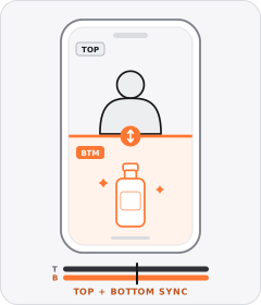
Stacked Split Screen
The vertical frame is split horizontally into top and bottom panels playing two clips at once.

Native Text Box
On-screen copy uses the rounded-corner background pills of TikTok's or Instagram Reels' built-in text editor.
 +2 sub
Problem-Solution
The ad establishes an everyday frustration in the first act and introduces the product as the fix.
Start free
Build a Split Screen ad in minutes
Start with 7 days free in a ready-made demo workspace. No credit card required.