Website Walkthrough
The ad steps through the brand's website, quiz, or checkout flow on screen to show how ordering or signing up works.
How to spot it
Scrolling a product page, completing an onboarding quiz, or clicking checkout, often with a small presenter overlay.
Verified on real video ads across 68 of 240 tracked brands (402 sightings across 79,497 ads).
Creative strategy
Why use Website Walkthrough
Showing the actual site experience removes uncertainty about what happens after a shopper taps the ad. Viewers see exact quiz questions, pricing tiers, or bundle options in advance, which warms up click intent and lifts landing page conversion rates. Pairing a scrolling screen capture with a talking presenter adds human guidance while keeping the buying path obvious.
When to use it
- Personalized supplement, skincare, and wellness brands preview short onboarding quizzes to set expectations before shoppers tap through.
- SaaS, web app, and membership brands walk through registration forms and pricing tiers to lower signup friction.
- Ecommerce stores with custom bundle builders or shade finders demonstrate how quickly shoppers can assemble a tailored order.
When to skip it
- Impulse-buy apparel or snack brands with simple product pages lose emotional momentum by spending airtime on checkout screens.
- Cold-audience campaigns targeting unaware shoppers stall if the ad opens on dense web text before framing a clear problem.
Production guide
How to produce Website Walkthrough
- 1
Record clean mobile-aspect screen captures at full resolution with browser bars, battery icons, and notification banners hidden.
- 2
Zoom into key buttons, quiz options, and discount badges during editing so small page text stays legible on phones.
- 3
Layer a green-screen presenter or brisk voiceover pointing directly at the steps buyers should take next.
- 4
Speed up routine scrolling and form entry slightly so viewers grasp the entire signup flow in five to ten seconds.
Common mistakes
- Recording wide desktop browser layouts for vertical placements shrinks web copy into tiny unreadable blocks on TikTok.
- Showing outdated pricing, expired promo banners, or mismatched layouts creates immediate distrust when shoppers reach the live site.
- Opening the ad with a slow page scroll fails to hook cold viewers before explaining why the offer matters.
Field notes
Observed in real ads
- 1
A creator is keyed over scrolling mobile screenshots of the company's landing page throughout the entire video.
- 2
The final section shows the website's sign-up form on screen to demonstrate how to register online.
- 3
The video transitions to a screen recording showing viewers where and how to fill out the online registration form.
Also called
Cross-layer recipes
Pairs well with
Combine Website Walkthrough with patterns from other layers to assemble a complete ad.
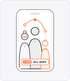
Multigenerational Cast
People from visibly different age generations appear together or across cuts to show cross-generational appeal.
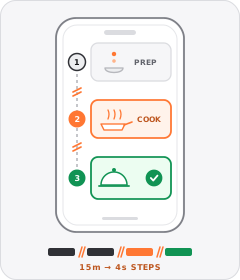
Process Montage
Rapid hard cuts compress the steps of a routine, recipe or packing sequence into a few seconds.
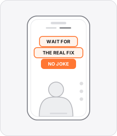
Native Text Box
On-screen copy uses the rounded-corner background pills of TikTok's or Instagram Reels' built-in text editor.
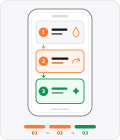
Step-by-Step Walkthrough
The ad breaks preparing, applying, or using the product into distinct chronological stages.
Start free
Build a Website Walkthrough ad in minutes
Start with 7 days free in a ready-made demo workspace. No credit card required.